
In the contemporary digital landscape, mobile traffic consistently accounts for over half of all global web activity. For businesses focused on growth, a website is no longer merely a digital brochure; it is a critical engine for lead generation. However, many organizations inadvertently sabotage their conversion rates by neglecting the most fundamental element of the mobile user experience: the navigation menu.
A mobile menu should serve as a seamless conduit, guiding potential clients toward high-value actions. When designed poorly, it becomes a barrier that frustrates users and drives them toward competitors. To maintain a competitive edge and maximize the return on your digital marketing investments, it is essential to identify and mitigate common structural flaws.
Below are seven critical lead generation mistakes currently impacting mobile menus and the proactive strategies required to rectify them.
1. Burying the Primary Call-to-Action (CTA)
One of the most frequent errors in mobile web design is treating the primary call-to-action (CTA) as a secondary thought. Many businesses hide their most important buttons: such as "Get a Quote," "Schedule a Consultation," or "Talk to Sales": deep within a nested menu structure. If a user must tap multiple times to find the path to conversion, the likelihood of abandonment increases exponentially.
The Solution: Elevate the Conversion Path
You must ensure that your primary lead-generating action is immediately visible upon opening the menu. Ideally, this button should be visually distinct, utilizing a high-contrast color that aligns with your brand identity while standing out from standard navigation links. Strategic placement at the very top or bottom of the menu container ensures that it remains the focal point of the user's interaction. For more insights on refining your overall strategy, consider reviewing our guide on 10 reasons your lead generation might be underperforming.
2. Implementing an Overloaded Information Architecture
While a desktop environment allows for expansive "mega-menus" with dozens of links, the limited screen real estate of a smartphone demands extreme discipline. An overloaded mobile menu creates cognitive friction, forcing users to sift through irrelevant information to find what they need. This "paradox of choice" often leads to decision fatigue, where the user chooses to exit the site rather than navigate a complex list.

The Solution: Prioritize and Simplify
A high-converting mobile menu should generally be limited to five to seven top-level items. You should audit your existing navigation and prioritize pages that directly contribute to the customer journey or provide essential social proof. Secondary information, such as "Privacy Policy" or "Careers," should be relegated to the footer or a secondary "More" category. By simplifying the architecture, you leverage the user's limited attention span to focus on lead-generating content.
3. Ignoring the Ergonomic "Thumb Zone"
Mobile users typically interact with their devices using a single hand, relying on their thumb for the majority of navigation. Despite this, many mobile menus place critical links at the top corners of the screen: areas that are the most difficult to reach during one-handed use. This lack of ergonomic consideration creates physical friction, making the process of requesting information or contacting your team unnecessarily taxing.

The Solution: Design for Accessibility
To optimize for conversions, you should place high-value interactions within the "natural thumb zone": the middle and lower two-thirds of the screen. Incorporating a bottom navigation bar for the most critical actions, such as "Contact" or "Services," can significantly improve the user experience. This proactive approach to accessibility ensures that your lead generation tools are literally within reach at all times.
4. Utilizing Inadequate Tap Targets
Precision is a challenge on mobile devices. When menu items are placed too close together or designed as small text links, users frequently suffer from "fat-finger syndrome," accidentally clicking the wrong item. This frustration is a significant deterrent to lead generation; a user who repeatedly fails to click "Contact Us" will likely abandon the effort entirely.
The Solution: Adhere to the 44-Pixel Rule
Industry standards, including those established by Google and Apple, suggest a minimum tap target size of 44×44 pixels. You must ensure that every button and link in your mobile menu meets this threshold, with ample white space between elements to prevent accidental clicks. This focus on precision not only improves usability but also signals a professional, high-quality brand experience. Improving these technical details is a key component of website conversion optimization.
5. Employing Vague or Internal Labeling
The labels used in your navigation should be descriptive and action-oriented. Many organizations use internal jargon or vague terms like "Solutions" or "Resources" that do not clearly communicate the value provided. If a user does not understand what they will find behind a link, they are unlikely to click it, resulting in lost opportunities for lead capture.
The Solution: Use Action-Oriented Language
Replace generic labels with specific, benefit-driven text. Instead of "Contact," consider using "Get a Free Audit" or "Speak with an Expert." This clarity reduces the cognitive load on the visitor and provides a clear incentive for them to move forward in the sales funnel. Furthermore, ensure that your labeling is consistent with your SEO strategy to maintain visibility across both traditional and AI-driven search platforms.
6. Neglecting Search Integration as a Shortcut
For users who have a specific goal in mind, browsing through a menu: no matter how well-designed: can feel slow. In many cases, users are looking for a specific service or solution. If your mobile menu does not offer a prominent search function, you are missing an opportunity to fast-track these high-intent visitors directly to a lead form.
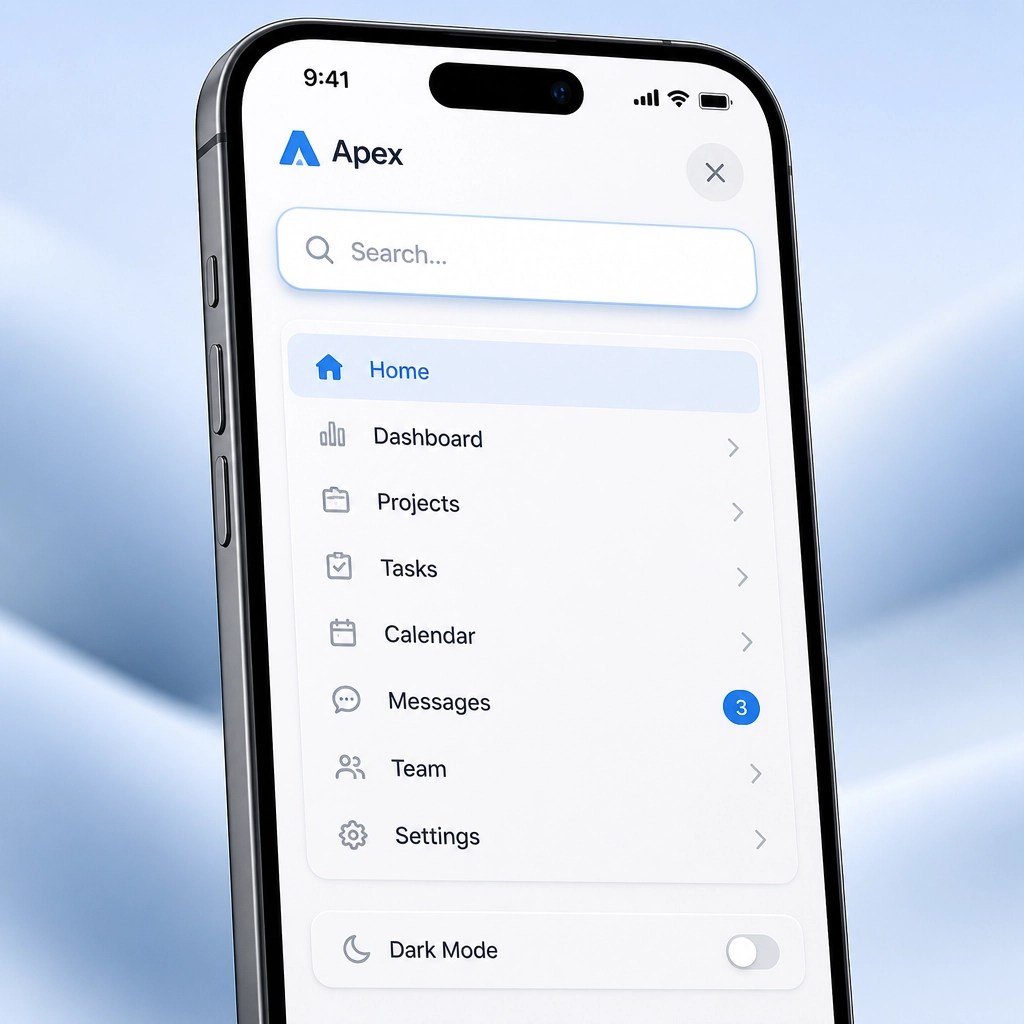
The Solution: Feature a Prominent Search Bar
Integrating a visible search bar at the top of your mobile menu allows users to bypass standard navigation pathways. For businesses with complex service offerings or extensive resource libraries, this is an essential tool for maintaining engagement. Predictive search features can further enhance this experience by suggesting relevant lead-gen pages as the user types.
7. Disregarding Navigation Persistence (Non-Sticky Menus)
On long-form pages or service descriptions, users may reach a point of interest halfway down the screen. If they must scroll all the way back to the top to access the menu or the "Contact" button, you have introduced unnecessary friction into the conversion process. This lack of persistence often results in a lost lead simply because the path to action was not immediately available when the user was ready to engage.
The Solution: Implement Sticky Navigation
You should leverage "sticky" or "fixed" navigation elements that remain visible as the user scrolls. On mobile, this often takes the form of a slim header with a hamburger icon and a primary CTA button, or a bottom-docked navigation bar. This ensures that the milestone of contacting your business is always just one tap away, regardless of the user's position on the page.
Summary: A Proactive Path to Growth
Optimizing your mobile menu is not merely a design preference; it is a strategic business decision. By addressing these seven common pitfalls: from elevating your primary CTA to ensuring ergonomic accessibility: you create a streamlined, professional environment that encourages visitor engagement.
In a digital landscape where every second of attention is valuable, your navigation must be intuitive, efficient, and relentlessly focused on the user's needs. If your current mobile presence feels like a "shrunk-down" version of your desktop site, it may be time to consider a custom WordPress design that prioritizes mobile-first performance and conversion.
At Integrated Mobile Marketing, we specialize in transforming digital challenges into growth opportunities. By refining the small details of your mobile user interface, we help you turn casual visitors into loyal, paying clients.