In the rapidly evolving digital landscape of 2026, web accessibility has transitioned from a conscientious "best practice" to a fundamental pillar of business sustainability. As enterprises strive to expand their digital footprint, the necessity of inclusive design becomes paramount. Accessibility is not merely a legal checkbox; it is a strategic advantage that enhances user experience (UX), broadens audience reach, and significantly bolsters Search Engine Optimization (SEO).
Recent data indicates that approximately 25% of adults in the United States live with some form of disability. When a website is built without accessibility in mind, it effectively excludes a quarter of the potential market. Furthermore, the correlation between accessibility and SEO is stronger than ever. Search engines like Google prioritize websites that provide a superior, navigable experience for all users, including those using assistive technologies.
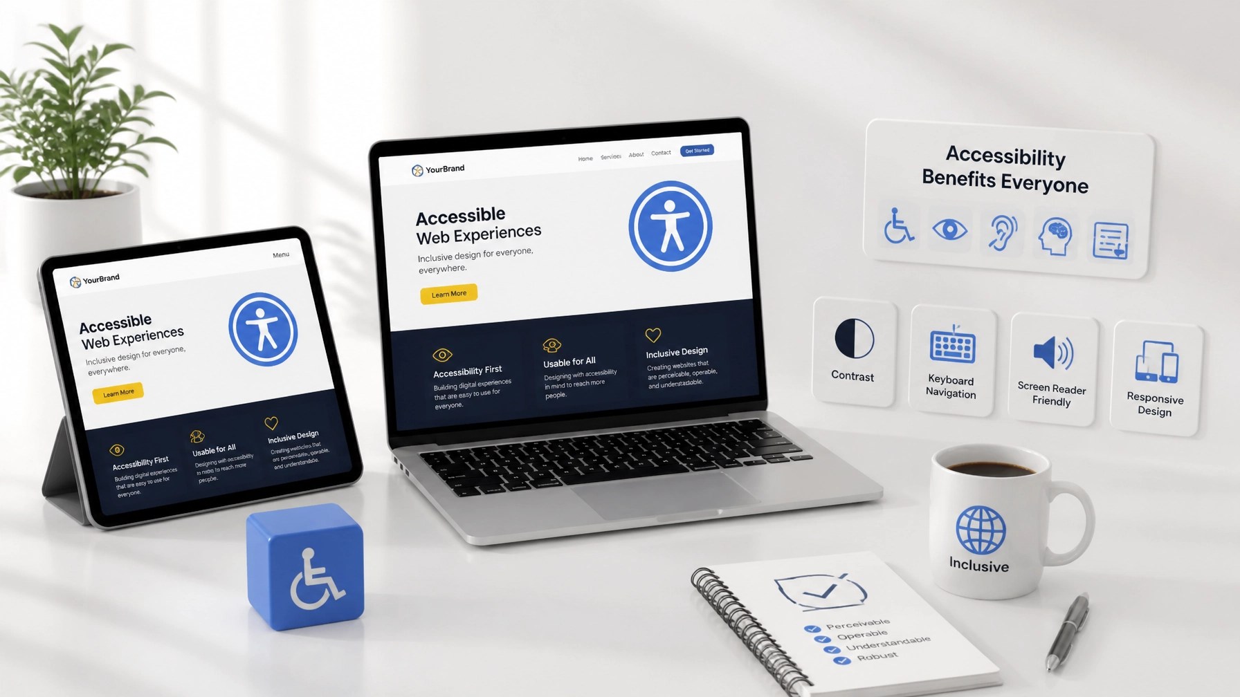
Despite its importance, a staggering 94.8% of websites still fail to meet basic Web Content Accessibility Guidelines (WCAG). To help you navigate these challenges, we have identified seven common accessibility mistakes and the proactive steps you can take to mitigate them.
1. Insufficient Color Contrast
Visual clarity is the cornerstone of an accessible interface. One of the most prevalent errors in modern web design is the use of low-contrast text and background combinations. While "minimalist" aesthetics often favor light grey text on white backgrounds, this choice can be nearly impossible for users with visual impairments, color blindness, or even those viewing screens in high-glare environments to decipher.
To ensure your content is legible, you must adhere to the WCAG 2.1 Level AA standards, which require a contrast ratio of at least 4.5:1 for normal text and 3:1 for large text. Achieving this milestone in design ensures that your messaging remains accessible to the widest possible demographic.

The Fix: Leverage tools like the WebAIM Contrast Checker to audit your brand colors. If your current palette falls short, adjust the saturation or brightness levels to meet compliance without sacrificing your visual identity.
2. Missing or Non-Descriptive Alt Text for Images
Images are vital for engagement, but for users with visual impairments who rely on screen readers, an image without alternative text (alt text) is a digital dead end. Furthermore, missing alt text is a significant missed opportunity for SEO. Search engines use alt text to understand the context and content of your visual assets, which directly impacts your ranking in image search results.
The Fix: Provide concise, descriptive alt text for every functional image on your site. Avoid generic phrases like "image123.jpg" or "marketing photo." Instead, describe the purpose of the image (e.g., "A modern workspace showing Integrated Mobile Marketing website development services"). If an image is purely decorative, use an empty alt attribute (alt="") so screen readers know to skip it.
3. Neglecting Keyboard Navigation
Many users, particularly those with motor disabilities, do not use a traditional mouse to browse the web. They rely on "Tab" and "Enter" keys or specialized switches to navigate. A common mistake is failing to ensure that all interactive elements: links, buttons, and form fields: are reachable and functional via a keyboard.
If a user cannot move through your site using only their keyboard, they will likely abandon your page, increasing your bounce rate and negatively impacting your site's authority.
The Fix: Test your website manually by navigating through it using only the "Tab" key. Ensure that there is a visible "focus indicator" (often a blue or yellow outline) that clearly shows which element is currently selected. This proactive step is essential for maintaining a user-friendly website.
4. Using Non-Descriptive Link Text
Phrases like "Click here" or "Read more" are ubiquitous but highly problematic for accessibility. Screen reader users often navigate by jumping from link to link. If the links are read out of context, "Click here" provides zero information about where the link leads, creating a confusing and frustrating experience.
From an SEO perspective, descriptive anchor text is a critical signal to search engines about the destination page's content.
The Fix: Use descriptive, action-oriented link text that makes sense even when isolated. Instead of "Click here for our services," use "Explore our custom website development services." This approach improves both accessibility and internal linking structure.
5. Improper Heading Structure and Semantic HTML
A well-organized heading hierarchy is like a table of contents for your webpage. Many businesses make the mistake of using headings (H1, H2, H3) based on visual size rather than logical structure. Skipping heading levels or using multiple H1 tags confuses screen readers and disrupts the flow of information.
Semantic HTML goes beyond headings; it involves using tags like <nav>, <header>, <footer>, and <main> to define the different sections of your site.

The Fix: Ensure your page has only one H1 tag and that subheadings follow a logical nested order (H2 followed by H3, and so on). This structure not only assists users but also helps search engine crawlers index your content more efficiently. For more on the technical side of site structure, see our guide on custom WordPress themes vs. templates.
6. Inaccessible Web Forms
Forms are often the final hurdle in the conversion process. If your contact or lead generation forms are not accessible, you are effectively turning away potential clients. Common mistakes include missing labels, poor error messaging, and time limits that cannot be extended.
The Fix: Ensure every form field has a permanent, visible label. Do not rely solely on placeholder text, as it often disappears when the user starts typing and is not always read by screen readers. Additionally, provide clear, descriptive error messages that explain exactly what needs to be corrected and where the error is located.
7. Over-Reliance on Automated Accessibility Overlays
In an attempt to achieve rapid ADA compliance, many businesses turn to automated accessibility "overlays" or widgets. While these tools claim to fix accessibility issues with a single line of code, they often interfere with a user's existing assistive technology and do not solve underlying code-level problems. In 2025 and 2026, many legal challenges have specifically targeted sites using these "quick-fix" solutions.
The Fix: True accessibility is built into the foundation of a website. Rather than relying on a widget, invest in a professional audit and manual remediation. This ensures a reliable experience for all users and mitigates the risk of legal complications.

The Business and SEO Case for Inclusive Design
Focusing on accessibility is a strategic business move. Accessible websites typically have cleaner code, faster load times, and better mobile responsiveness: all of which are significant ranking factors in the current search environment. By making your site easier to navigate for everyone, you are naturally optimizing it for search engine algorithms.
Furthermore, a commitment to inclusivity enhances your brand's reputation. Clients value proactive guidance and businesses that demonstrate a genuine concern for all their visitors. When you prioritize accessibility, you turn a passive visitor into a loyal, satisfied client.
How Integrated Mobile Marketing Can Assist
At Integrated Mobile Marketing, we specialize in creating high-converting, user-friendly websites tailored to the unique needs of your business. Our expertise in WordPress development and custom themes allows us to build accessible, ADA-compliant digital experiences from the ground up.
Whether you are launching a new project or looking to remediate an existing site, our team provides the technical precision and strategic support needed to ensure your brand is found: and used: by everyone online.
Summary
- Audit Contrast: Maintain at least a 4.5:1 ratio for text.
- Describe Visuals: Use descriptive alt text for images to boost SEO and accessibility.
- Enable Keyboard Use: Ensure all interactive elements are reachable without a mouse.
- Be Descriptive: Use anchor text that clearly identifies the link's destination.
- Structure Logic: Use semantic HTML and a proper heading hierarchy.
- Refine Forms: Use visible labels and clear error indicators.
- Avoid Shortcuts: Focus on code-level accessibility rather than surface-level overlays.
Building an accessible website is a continuous journey of improvement. By addressing these seven common mistakes, you can provide a more inclusive experience, mitigate legal risks, and strengthen your digital presence in 2026 and beyond. If you are ready to elevate your website's performance and compliance, contact us today through our client support portal or visit our blog for more digital marketing insights.